

How to choose your Brand fonts
I'm Ash
I help visionaries create luxury
brands & websites with purpose.
How to choose your Brand fonts. Have you ever looked at your Brand and wondered if the fonts you’ve selected are resonating with your dream clients?
Fonts are equally important to your branding as your colour choice. The typography palette selected helps to tie in all your visual communication together, from the copy on your print collateral to digital areas such as your website. All of these elements combined create brand consistency and memorability.
When choosing your fonts to represent your brand, you need to consider if they will appeal to your target audience, do they work well together, and whether they balance and convey the right message.
Before selecting your fonts it’s good to get an understanding of what a typeface vs. font is.
A Typeface is a category of a font collection such as Serif, Sans Serif, Script etc.
A font is the style of the typeface such as Arial that is a part of the Sans Serif family.
Below is an overview of four different typefaces:
Serif:
Serif fonts have extended features, giving them the name ‘serif’ commonly on the ends of each alphabetical letter. Serif fonts have been around since the old Roman era. They are easily read and great for large text, books, headings or blogs.
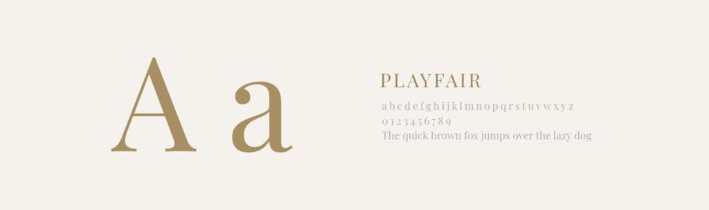
Personality type: classic, timeless, trustworthy, traditional and elegant.
Examples: Times New Roman, Playfair Display and Lora.
Sans Serif:
Sans Serif fonts exclude this extended feature that is seen in the Serif typeface family. They work well in large-format copy text areas, large-scale print and website body copy.
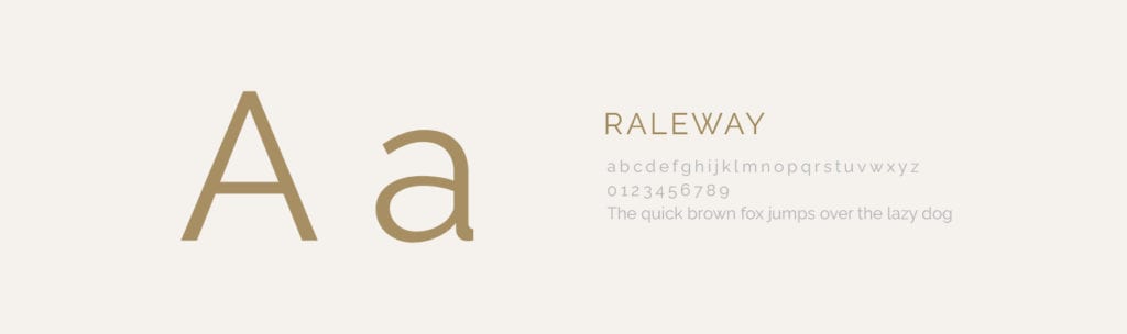
Personality type: minimal, modern, clean, contemporary and sophisticated.
Examples: Raleway, Calibri and Montserrat.
Monospace: Slab Serif
Slab Serif fonts were originally for typesetting/printing. Each alphabetical letter has the same amount of horizontal fixed spacing.
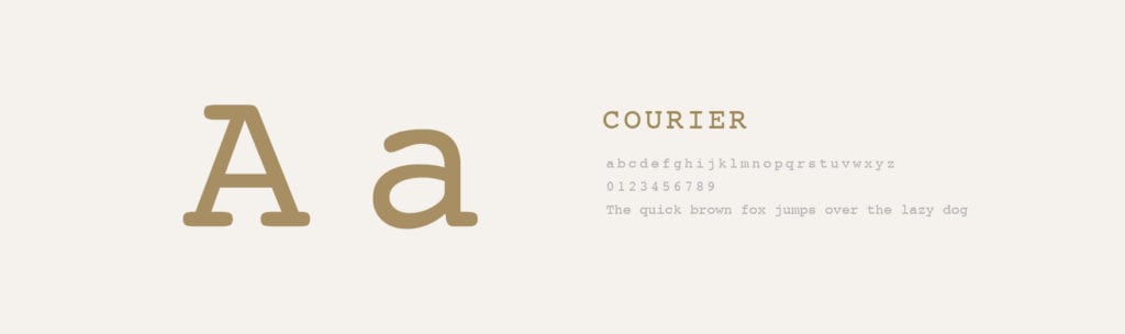
Personality type: old school, technical, organised and knowledgeable.
Examples: Courier, Monaco and Lavina.
Script:
Script fonts have fluid/varied strokes that imitate handwriting. There are various types of Script fonts from casual to formal depending on the look and feel you are hoping to achieve for your brand. Some Script fonts can be hard to read so are recommended to use minimally for areas such as headings, subtitles, quotes or pull-out text.

Personality type: feminine, girly, warm, elegant and luxurious.
Examples: Darcy Oliver, Lobster and Big Spender.
How to pair your fonts
Now that we have explored four examples of different typefaces, it’s time to learn about pairing fonts together. The key is to find the perfect balance with the fonts you select and keep them consistent and cohesive throughout your branding.
Different typefaces evoke different feelings and convey different personalities for your brand and collateral. This is why it is super important to be intentional with your font choices and pairings. Different moods can also be created with varying letter spacing, colours and positioning.
If the fonts you’ve chosen don’t match your brand identity or personality it can present the wrong look and feel. An example is if you had an elegant and high-end brand and chose to use an old school slab serif font, this would not present the look and feel of an elegant/high-end brand.
If you’re struggling to pair your fonts, this is all part of my design process and included in my branding packages. If you’d like to try it out yourself, there are free resources available such as:
Canva Font Combinations: https://www.canva.com/font-combinations
FontPair: https://www.fontpair.co/
Font Pairing Example:
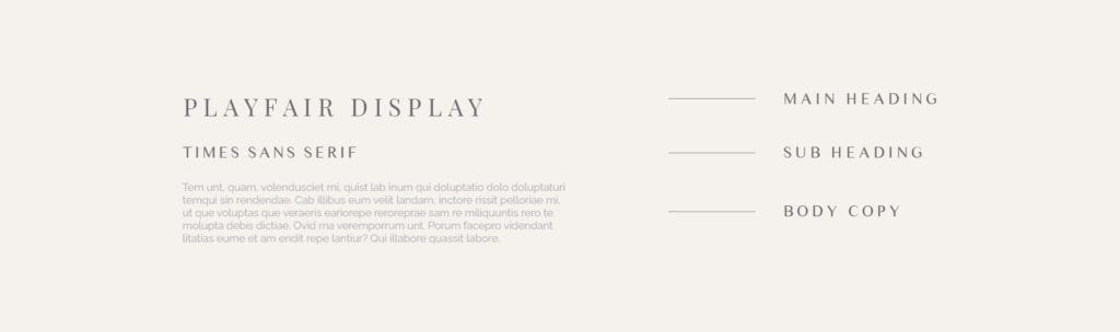
Below I’ve prepared an example of an elegant font pairing combination using:
1 – Main Heading: Playfair Display
2 – Sub Heading: Times Sans Serif
3 – Body Copy: Raleway
Selecting Fonts:
I recommend selecting a combination of 2-3 fonts for your main brand fonts with 1-2 complimentary/feature fonts. If you have too many fonts this will appear cluttered, messy and busy. This is the same for your brand colours.
Choose a strong main/primary font that you can use for your headlines/titles. Then select a secondary font for your body that will compliment and balance your primary font like the example above. You can also highlight different elements of your fonts by using features such as bold, italic, spacing, size etc.
Once you have selected a solid font combination, be sure to use them consistently to present an established and cohesive brand across every touch point of your business.
My favourite font resources:
Below are a few links to different font resources, some are FREE and others will require the creative licence to be purchased. They even have a preview generator so you can see an example of your text! Be sure to check the licensing conditions when downloading your fonts, these will be available on the site and/or download information.
Dafont: https://www.dafont.com/
Google Fonts: https://fonts.google.com/
Font Squirrel: https://www.fontsquirrel.com/
Creative Market: https://creativemarket.com/fonts
If you’re feeling detached from your current brand, fonts, designs or logo it’s definitely time to consider investing in a brand designer. If you’re not sure where to start, you can claim my FREE Brand Checklist Gain clarity for your business, audience, goals and more!
If you’re leaning towards hiring a designer and would like to learn more, reach out here to book a FREE Discovery Call to learn how I can help you establish a clear strategy and brand identity.


