

3 Logo Variations Every Brand Needs
I'm Ash
I help visionaries create luxury
brands & websites with purpose.
3 Logo Variations Every Brand Needs. It’s important to have multiple versions of your logo to keep your branding consistent across all platforms – digital through to print media. Flexibility is the key to having various logos to suit different formats. Read on for my top three recommended logo variations that your brand needs.
But first, what is a logo variation?
A logo variation is your primary logo rearranged into another layout/format. The purpose of different variations is so you can apply your logo throughout your content/marketing materials while keeping your logo recognisable and consistent.
And why do you need different versions of your logo?
Depending on the space you are working with, it’s great to have different versions of your logo that will fit within the intended area. Below are the three variations you should have in your brand and how to use them.
01 – Primary logo design (Portrait)
Your primary logo is exactly that – your most commonly used logo. This can include your (if applicable) your icon, business name, tagline and any other additional information e.g. Established 2021. This main logo will be used on your website header, business cards, marketing materials, brand collateral etc.

In this example for my client Natalie Grant the primary logo includes her icon, business name, established date and business name stacked evenly to create a nice balance and present the important information.
02 – Secondary logo design (Landscape)
Your secondary logo is a landscape version of your primary logo. It is typically longer then your primary logo but shorter in height. This enables you to place this variation in narrower areas where you have to shrink the logo down such as social media, small/narrow banners and small print areas.
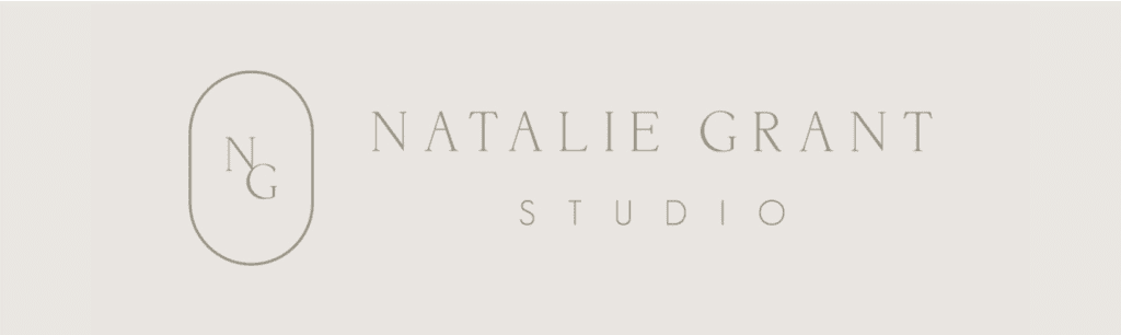
In Natalie’s secondary logo we have included her business name only with her icon to the left. Your secondary logo can either include or exclude the icon, depending on your preference and where you plan to use it.
03 – Brand Elements (Icon)
If your primary logo includes an icon, this variation is of the icon only without any of the text elements. Icons are great for creating patterns, watermarks, favicons, social media profile images and tiny print areas.
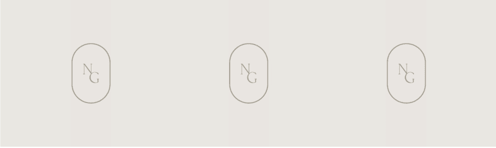
For Natalie’s icon, it is exactly that – her icon only with her initials ‘NG’ encapsulated within the beautiful antique inspired shape to represent her artesian jewellery business. Your icon should be a simplified version of your logo but still instantly recognisable to your primary logo.
The most important thing when creating your logo variations is to ensure they are all a true representation of your primary logo so that together or by themselves your audience will be able to identify the logo variation to your brand.
I have created different packages to include these three important logo variations so that you will have a brand identity that will last and adapt as your business grows. Do you have these three logo variations included in your brand identity? If not, it’s beneficial to have these added so you can make the most out of your logo.
If you’d like to work on these elements with me or would like to learn more, book a FREE Clarity Call.
The Journal


© White Ink Creative 2019-2026 |

