

From five years in to finally feeling like her: the Coco + Ash rebrand
I'm Ash
I help visionaries create luxury
brands & websites with purpose.
Coco + Ash rebrand — luxury brand design case study | White Ink Creative.
From five years in to finally feeling like her: the Coco + Ash rebrand
There’s a particular kind of readiness that comes after years of doing the work.
Not urgency. Not desperation. Just a quiet, clear knowing — that the version of your business you’ve been building toward deserves to be seen. Properly. Finally.
That’s exactly where Chelsea was when she came to White Ink Creative.
Five years into running Coco + Ash Weddings and Events, she had built something genuinely beautiful — a reputation, a style, a client experience that couples trusted and adored. But the brand? It was still telling the story of where she started.
She was ready for it to catch up.
The brief: mature, chic, and unmistakably them
When Chelsea reached out, her vision was clear. She wanted a rebrand that elevated the Coco + Ash visual identity — something modern and refined, with a distinctive place in the luxury wedding and events market. The goal wasn’t just to look better. It was to attract aligned couples and clients who were already drawn to the aesthetic, the experience, and the standard that Coco + Ash represented.
As a luxury brand designer, this is the kind of project I love most — where the business is already exceptional, and the design work is about bringing the visual identity into alignment with the truth of what’s already been built.
We didn’t need to reinvent Chelsea. We needed to reflect her.
The process: strategy before aesthetics, always
Every Brand Design Experience™ at White Ink Creative begins long before a single design file is opened. We start with a deep dive into strategy — exploring the brand’s audience, positioning, competitors, and the feeling it needs to create in the minds of the right people.
For Coco + Ash, that meant understanding the couples Chelsea most wanted to attract — their aesthetic, their values, the kind of wedding they were dreaming of. It meant uncovering what made Coco + Ash different in a crowded market, and how to make that difference immediately, unmistakably visible.
Only once that foundation was in place did we move into design.
The work: what we created together
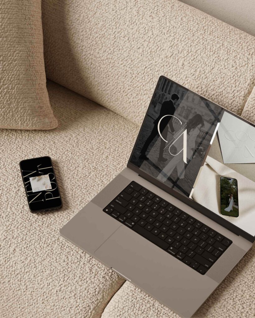
The Coco + Ash rebrand was a full brand identity transformation, designed to work cohesively across every touchpoint — from print to digital to social.
Primary logo — A refined serif wordmark with clean lines and a quiet touch of personality. Elegant without being rigid. Memorable without being loud.
Monogram mark — A C/A monogram with a luxury editorial feel, designed to function as a versatile brand element across stationery, digital, and social applications.
Colour palette and typography — A warm, sophisticated palette rooted in cream, champagne, and charcoal — timeless tones that communicate quality without effort.
Brand stationery — Business cards and printed collateral designed to feel as considered as the events Coco + Ash creates.
Mini brand style guide — A comprehensive reference document to ensure consistency across every point of contact.
Bespoke social media templates — A custom suite of Canva social templates built to match the new brand identity, so Chelsea could show up on Instagram with the same elevated presence from day one.
The result: a brand Chelsea is genuinely proud of
What I love most about this project is what Chelsea said when it was done.
“We are so proud of all the work that went into this rebrand. Our vision was to elevate our visual identity to be mature, chic, and modern — and White Ink Creative brought that to life. Thank you for taking all of our ideas and wishes and finessing them to be exactly who we want to be and for the couples we want to attract.” — Chelsea, Coco + Ash Weddings and Events
That word — proud — is everything. Because that’s what an aligned brand does. It doesn’t just look better. It changes how you feel about showing up.
Chelsea launched her new brand with a confidence that had always been there, waiting for the visual identity to match it.
Why a luxury brand designer makes the difference
A rebrand of this nature isn’t just about new logos. It’s a strategic investment — one that requires a designer who understands not only aesthetics, but positioning, audience psychology, and the long-term impact of every visual decision.
At White Ink Creative, every project is handled personally — by me, from the first discovery session to the final file handover. There are no junior designers, no templates, no shortcuts. Just a deeply considered, high-touch process designed to produce something timeless.
If you’re a woman-led business ready to invest in a brand that truly reflects the work you’ve built — I’d love to hear from you.
Ready for your next chapter?
The Brand Design Experience™ is designed for established women in business who are ready for their visual identity to catch up with who they’ve become. Need a website too? Explore the Brand and Website Experience.
Explore the experience and apply to work together at whiteinkcreative.com.au.

